Archive for the ‘Darkroom’ Category

Selective Masking for Printing Challenging Negatives

Tuesday, August 24th, 2010

Get Total Consistency from Print to Print

Over the years I’ve evolved a technique I have come to refer to as Selective Masking. I use the term “selective” because it is a physical, hands-on method of tonal control in analog printing, rather that the photometric “unsharp masking”. In its basic form, it’s not techno-anything; it simply is a means of solidifying your own dodging and burning preferences into a “package” which remains absolutely constant from print to print.  You can change your mind about how you want that package to perform; you can dodge and burn in greater detail than with traditional methods and with absolute consistency from print to print.  It works with either a diffusion enlarger or in contact printing.  It does NOT work with condenser enlargers.

Carried to the ’nth degree, Selective Masking can transform the job of printing a challenging negative from one of agonizing difficulty to the mere push of a button: a “straight” print from the untouched, unmodified original negative. Any size print. Local contrast changes can be made, and that oh-so-smooth gradual sky burn can be built into the mask package.

Available in my Online Store:  Want to turn a difficult negative into a straight print?  This technique has worked well for me in the over 20 years I have been refining it and has been updated to reflect more sophisticated digital techniques.  Selective Masking Articles on CD

.

.

.

.

.

.

.


June Newsletter

Saturday, June 19th, 2010

New Masking Articles, Digital Film Negatives

Film Negatives from Digital Files

Saturday, June 19th, 2010

Making Film Negatives from Digital Files.

Last year I had a wonderful assignment photographing gnarly, twisted zinfandel vines for Ravenswood Winery in California’s Sonoma and Napa Valleys.  As the project took shape, it was decided that because some of the vineyards had a lot of irrigation tubing and other unsightly distractions, the final output would be high quality inkjet prints so that unwanted features could be edited out in Photoshop.  That all worked out fine, but Joel Peterson, Ravenswood’s founder, wanted some 16×20 silver prints for his office.  Two of those images, alas, had tubing and re-bar included in the scene which were impossible to just touch-out in a print.  It was either print the lovelies, “warts and all” or get a crash course in going from film to digital file and back to film.  So I chose “crash course.”  I knew one of my student friends in Southern California had been getting into this field and we conspired to use my project to work out the details.  After a few false starts, we succeeded in going from my original 6×7 BW negative to high-res RGB scan and on to a new 4×5 T-Max 100 negative!  Lovely 16×20 silver prints were the final result. Bonus: they needed virtually no spot-retouching because that was all fixed in the digital file!

Next I’m going to work on making a BW negative from a color digital image I made in China when I didn’t have access to my 4×5!

The bottom line is that I now feel it is realistic to make repairs and adjustments to images that otherwise might be set aside as unusable for silver printing.  For pricing and further information on the process contact Ludo Leideritz at Reflective Image Studios.

36

Left: scan from original negative; Right, scan from silver print from digital negative.
Barricia Vineyard, planted 1888.

Notes on the new Adox MCC 110 FB paper

Thursday, February 18th, 2010

When I “test” a new paper, or one I haven’t tried in a long time, the first thing I like to do is see how it “feels” compared to a paper I’m used to.

When I got my first sample of the Adox paper, I had just finished producing a batch of Ansel Adams’ Moon and Half Dome prints for The Ansel Adams Gallery. Since the negative (made on 120 Adox R17 12/28/1960) was still in my Omega D5500 enlarger, I had a perfect opportunity to see exactly how the paper would perform with a high quality image I had printed many many times.

The first result: an absolutely lovely image. It required no change in the “no filter” setting I usually use with this negative on Ilford Multigrade FB – so “normal” contrast seemed to be right on. It had a beautiful gradation of tonality from blacks to clean whites. It seemed a bit faster than the Ilford, but for the Adox test I was using a higher concentration of Dektol than I had used for the production printing.

(more…)

New Darkroom Timer

Tuesday, June 23rd, 2009

CompnTempscreen_sWorkshop alum and Stanford scientist, Curt Palm, has created a new darkroom timer that significantly “one-ups” the popular Zone VI Compensating Developing Timer.

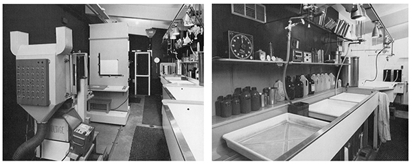
CompnTemp ® is software rather than hardware and is available for both Windows and Mac computers. I set up a small shelf in my darkroom for my Mac Powerbook and all I have to do to get going is plug in the accessory USB temperature probe and cover the screen with red plastic.

What sets CompnTemp apart from ANY other timer is that is completely user-programmable. if you want your target temperature to be 73 degrees instead of 68 that’s fine. If you want it to count UP instead of DOWN, that’s fine, too.

You can save profiles so you can toggle from one group of settings for prints to another set of preferences for film. It even lets you customize the compensation curves.  It also gives you a continuous read-out of the ACTUAL temperature.

(more…)

Variable-Contrast Articles – Reprints now on CD-ROM

Tuesday, June 23rd, 2009

In 1998 and 1999 I wrote a 4-part series of articles on Variable-Contrast printing for CameraArts magazine (the “smaller-format” sister of ViewCamera magazine). CameraArts is now defunct in print form however the articles are still available directly through me.

If you have been one of my students and would like something better than the xerox copies of the articles you got in your workshop binder, contact me. I’m offering the Variable-Contrast CD for $30. I’ll even sign it! It’s a single CD with a pdf file which has daisy-chained the four articles together.

Lastly, the illustration photos in the pdf file seem to print a bit on the mushy side with some printers. I suggest printing a single, sample page such as p.23 or p.24 and adjust the contrast and brightness settings on your printer until the images print satisfactorily.