For me, a photograph is very much a kind of language. It can be as practical and unadorned as an entry in an encyclopedia. It can be a set of instructions. It can be a chapter in a novel or it can be haiku. And for those of us to whom words do not come easily, a photograph becomes the language that allows us to express who we are, what we think and how we respond to the world around us.
But every language needs a vocabulary of sorts, and in photography, that vocabulary can be color or black-and-white, abstract or factual, expression or documentation.
Having been Ansel Adams’ full-time assistant for five years, and exclusive printer of his black-and-white Special Edition Prints of Yosemite for over 40 years, it comes as little surprise to most people in the photo world that I choose the “language” of black-and-white photography to express myself. (BW).
While I have enjoyed working in color at various points in my career – I assisted in a high-end, largely color, advertising studio for three years before my time with Ansel and operated my own advertising studio for a dozen years after that – I have to acknowledge a preference for my monochrome world.
By its very nature, BW is an abstraction of reality. With color work, unless I am doing something dramatically arty, you are likely going to feel something is “wrong” if I show you a landscape with a green sky or a portrait with purple skin. There is an inherent expectation of “reality” with color.
With BW, however, I can render a rich blue sky as something light and airy with little distinction between cloud and sky, or as something deeply moody, with strong separation between cloud and sky.
Neither of these variations is dependent on color, and neither would give rise to a feeling of something being “wrong;” they are just an interpretation or a more personalized way of expressing a feeling or reaction to a scene.
It’s very liberating to create one’s own version of reality instead of being held to the reality of what is actually in front of the lens.
Working in BW doesn’t have to be difficult, but it does require some thought with regard to tools and approach.
“Seeing” Black-and-White in a Color World
A major consideration is that fact that even though we may be working towards a BW image, the world in front of our lens (and our eyes) is in living color.
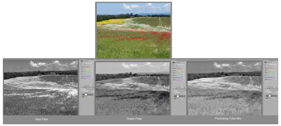
To help me make a visual “leap” from color to BW, I look beyond the colors in a scene and instead look at the relationships between those colors. Then I imagine how I can manipulate those relationships through the use of filters to create emphasis or focus.
When I’m working with film, I have to imagine the effect of a filter before I release the shutter. A filter in front of the lens lightens its own color, darkens its opposite and leaves neutrals unchanged. Exposure has to be increased to compensate for the density of the filter.
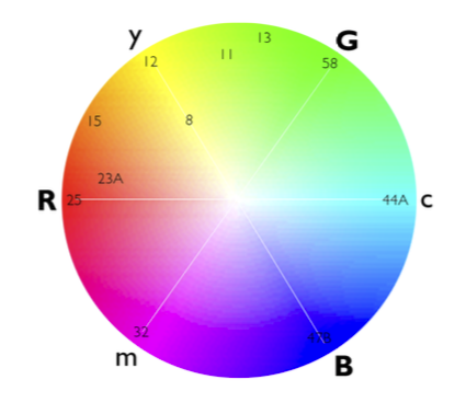
The color circle above shows the scientific relationships of primary colors. Red is the opposite of cyan, yellow is opposite blue, and magenta is the opposite of green. Knowing these relationships helps you anticipate the effect of a filter, or suggest what filter will give you the effect you want.
With a strong red filter, for example, I can render a green leafy plant in front of a reddish sandstone wall as a dark plant against a light and delicately textured wall. (Green is nearly opposite of red.) Or with a deep green filter, I can render that same plant as very light against a dark and moody wall.
When working digitally, I make the capture in RAW and then experiment with different interpretations of these relationships using controls in Lightroom or Photoshop. Each color in the capture can be manipulated independently from other colors, and since the skewing is done in post-processing, no exposure compensation is necessary.
The illustration below shows how Photoshop can be used to either mimic the effect of a filter in front of a lens, or, in playing with different colors, can create a completely unique effect.
Post Processing Tonal Control
Another freedom from reality in working in black-and-white is being able to dramatically modify tonal contrasts and densities in a way that seems natural and perfectly reasonable, but would look like a big mistake in color.
A case in point is with the use of considerable tonal controls to realize my objective with one of my most significant photographs, Bridalveil Fall in Storm, Yosemite 1974.
I was running the darkroom for one of Ansel’s Yosemite workshops, and the entire group took a “high country” field trip on a day a fluke thunderstorm rolled through Yosemite. The wind and rain cut the trip short.
Heading back into Yosemite Valley with some fellow assistants, I encountered an amazing view of hanging clouds and Bridalveil Fall. We screeched to a halt and reached for our gear. I set up my 4×5 camera, made two exposures, changed lenses and then made two more exposures.
Since my workshop job was running the darkroom, I developed the film the same day and contact proofed. But the proofs were a bore! They had all the tones, but none of my “mood.”
In making the image, I had felt a deep impression of a dark brooding storm with heavy sky and vibrant hanging clouds. When I got home and made my first print, I wound up increasing the contrast in the foreground clouds and forest, and darkened the sky to achieve the mood I had felt for the image. Success!
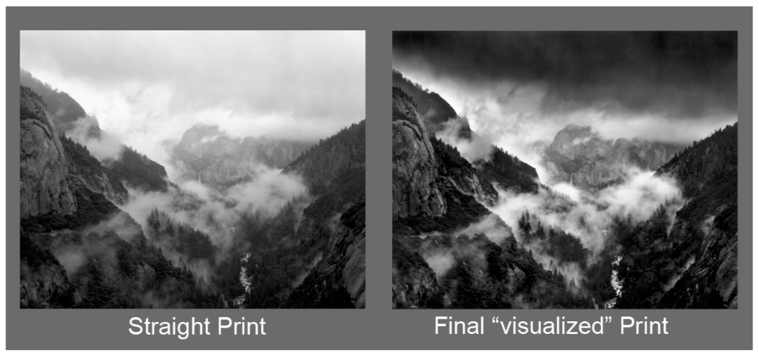
Upshot: a black-and-white image, being already an abstract of reality, can render a scene with considerable drama, or delicate nuance without looking forced or “wrong.” The photographer is in charge of his or her own reality.
Making an Image
Following are a few tips for getting the best shot – digital or analog. The principles of photography are largely the same, whether working with film or digital, but the particulars of achieving a desired vision in black-and-white with the different platforms require some different techniques. When I am contemplating making an exposure, I tend to think of things in the following order:
Composition: What is it that attracted me to the scene or subject in the first place? Where is the best place for my lens? My relative position to the subject(s) establishes the structure of the image. If I move a bit to the left, does a tree branch start to get in the way. If I lower my eye, does a fence-post start to bump into the prime object of my image. I have made some images where the difference of an inch or two in lens position could make or break a composition.
All of this is done before I ever get my camera out, and I frequently use a framing card or my hands to “audition” my composition.
Quoting Mark Twain in his essay Fenimore Cooper’s Literary Offenses: “Eschew Surplussage!” If it’s not needed in the image, don’t include it. Or at least minimalize it.
Lens choice: The only thing a change in focal length really does is change the cropping of your image. Choose your spot then choose the focal length that gives the best cropping. Choice of lens has no effect on the subject structure of an image – that is governed by the location of the lens relative to the subject(s). What is often attributed to “lens compression” is actually a result of changing lens location to suit a long focal-length lens. If the camera position is not moved, the relationship of elements in a scene remains unchanged regardless of focal length.
Filter choice: If you are working digitally, most filter effects can be done in post-processing, as explained above. The exceptions are in using ND filters to extend exposure time, and polarizers to darken skies or control reflections. A 1A Skylight filter can cut through haze nicely. With analog or Leica Monochrom, a colored filter has to be decided on before exposure.
With digital, it is possible to see the effect of BW right away. While I tend to capture only in RAW mode, if you set your camera to capture in both RAW and jpeg with a monochrome setting, most cameras will show the jpeg as a BW image. If you want to preview the effect of a filter, you can put an actual filter in front of the lens and the image review will show that color effect!
Exposure: With digital, the crucial approach is to not over-expose highlights. If the sensors are overloaded, there is very little, or nothing, to recover in post-processing. A washed-out white cloud is much harder to live with than empty shadows – and deep shadows can often be recovered to a surprising degree.
The histogram will also tell you immediately whether you have held your highlights! If the histogram is slammed into the right side of its window, reduce your exposure and do another capture. Hopefully your subject is still there for a second try!
With film, the opposite approach is the rule. The one thing that cannot be fixed after the fact is under exposure. It takes a scientific amount of light to rattle the silver molecules enough for there to be anything to develop. If the film does not get that minimum amount of light there is nothing to print or scan; just clear film.
Finding your Muse: Is the Language of Black-and-White For You?
So is black-and white for you? Only you can answer that. There are countless, stunning color images that would be a complete bore in BW. If National Geographic or NASA worked only in BW there would be so much in and out of this world we would know nothing about. If flowers and fall colors were only shown in shades of gray how dreary! I photograph to express my feelings about things I see. I do photograph a lot in color, but it is the black-and whites that let me express a reality in a very personal way.
Most important: Have Fun! Take your subject to heart before bringing your camera to eye. Photographing roses? Take a moment to smell them first!
Bob Thiessen
Alan