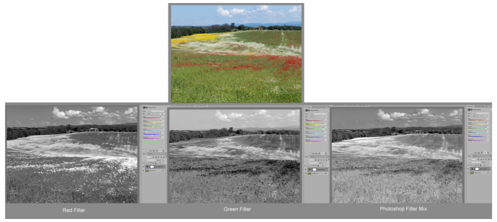
The Polarizing Filter – You Can’t Mimic It In Photoshop!
A polarizing filter is one of the few filters that are equally effective with color imaging and with black-and-white. It can: • Minimize or eliminate reflections in glass, water or most any surface except metal. • Darken skies in color photos as well as in black-and-white • Cut through haze • Increase the saturation of…
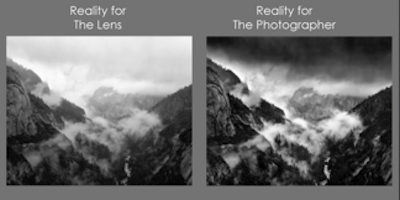
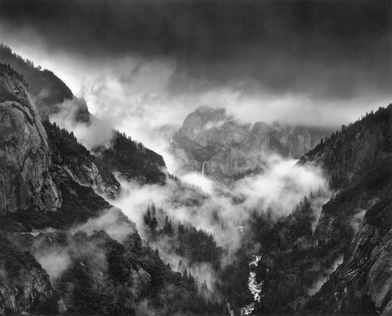

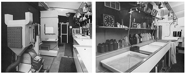
The Language of Black and White Photography
For me, a photograph is very much a kind of language. It can be as practical and unadorned as an entry in an encyclopedia. It can be a set of instructions. It can be a chapter in a novel or it can be haiku. And for those of us to whom words do not come…
Read More